Understanding How Search Engines Work

When most people want to find something on the Internet, whether on Google or Facebook or Bing or YouTube, they use keywords to search for it. Search engines are the number one way people retrieve information on the Internet, so building a site that is easily accessible to search engines is, perhaps, the most important component of a strong internet marketing campaign. Unfortunately, most people do not understand how search engines work and therefore have difficulty making their web pages “rank” or appear on the search engine results page for valuable keywords. A basic understanding of how search engines work can greatly enhance your chances of getting quality leads through your website.

In order to find relevant web pages for every possible keyword that is entered by a user, search engines employ software, known as bots or spiders, to catalog as many pages on the Internet as possible. Once a bot comes to your website it will look for information that identifies what your site is about. The bot uses the words you put in your title, in your text, and in your URL to catalog the site as being associated with a particular keyword. The bot may also try to determine whether other sites on the Internet think your website is related to a particular keyword. It does this by examining the context in which other sites link to your site. For example, if 100 websites linked to another website with the phrase “blue widgets” a search engine would determine it is likely that website has something to do with blue widgets.

Continue reading


Website Makeover Analysis and SEO Audit

Does Your Website Need a Little Help? – Answer These 7 Questions to Find Out

  1. Was your website built by a friend, relative or family member years ago and currently in need of some updating?
  2. Has the traffic to your website continued to decline over the last few months or years?
  3. Do you need to quickly attract more QUALIFIED prospects to your website?
  4. Are you looking for new and inexpensive ways to convert more visitors into paying customers?
  5. Would you like to have more of your website visitors sign up to get your online or offline company newsletter?
  6. Are you looking for more ways to get your website to show up on the first page of Google for your keywords?
  7. Would you like to know some of the specific strategies your competition is using to drive traffic to their website?

If you answered yes to any of these questions then this makeover analysis can definitely help you and your business.

We conduct a thorough analysis of your current website which includes both the front end (what your website visitors see) and the “backend” (the html coding – what the search engines see). We then provide specific strategies that you can either do yourself or give to your webmaster to implement.

The typical plan ranges between 40 – 60 pages long and takes about one week to complete. Once we complete the plan, we e-mail you a PDF copy and schedule a personalized 90-minute one-on-one online meeting to review the entire website makeover analysis. We do this using “Join.me.” This let’s you sign on to your computers and view whatever is on our computer screen. We will walk you through the analysis, page by page and answer any questions you may have.

Here are Just a Few Things That You Get With Your Website Makeover Analysis and SEO Audit:

  • An overall website critique with specific suggestions for improvement in the areas of visual appeal, layout, text readability, download time, etc.
  • Navigation review and ease of use suggestions
  • Onsite optimization analysis including meta tags, titles, keywords, images and descriptions
  • Traffic analysis – where your traffic is coming from and how visitors found you
  • Inbound link review
  • How you compare to your top 3 competitors in terms of traffic, links and keywords
  • Strategies to obtain more inbound links using social media websites, blogs and video
  • How to incorporate audio and video on your site
  • What pages need to be improved or added
  • Call to action strategies
  • Unique and FREE ways to improve your visitor experience, get them to stay longer and get them to return more often

The Specific Strategies and Recommendations That We Will Give You Can be Used to Grow Your Business by Helping You:

  • Capture more leads
  • Improve and provide easier navigation for visitors
  • Achieve better on-page/site search engine optimization (SEO)
  • Improve search engine marketing
  • Enhance your company image
  • Appeal more to your target market
  • Enhance and automate follow-up marketing
  • Increase your referrals
  • Better integrate social media marketing
  • Make your site become more viral
  • Incorporate your company’s unique selling proposition (USP)
  • Make your site get searched by search engine “spiders” more often

The Cost of the Website Analysis and SEO Audit is Only $295.

Call us today to order.


Website Rescue Squad

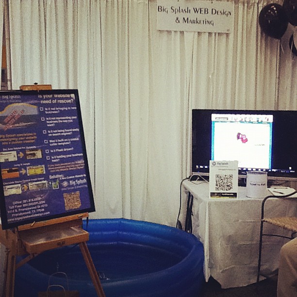
We literally made a Big Splash at the Clear Lake Chamber Business Expo 2012 held at Gloria Dei Lutheran church last month with our Website Rescue Squad campaign!


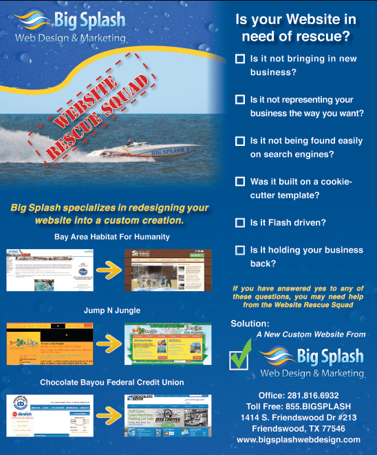
The campaign was initially created for the full page ad we are running in the Bay Area Houston Magazine (we just redesigned their website, go check it out).


Our Full Page ad in the June 2012 issue of Bay Area Houston Magazine

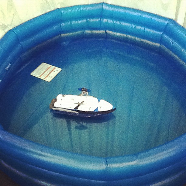
One of our biggest mottos is “branding first”, so to keep with the theme of the ad, and to have something fun for our visitors to do, we brought in Big Splash 1!

Big Splash 1 became the mascot of our booth; visitors got to drive our trusty aquatic vessel and gave us an opportunity to start a conversation with them.

We were also involved with the “QR Code Scavenger Hunt“- expo visitors with QR code scanners on their mobile devices were able to participate by hunting for 7 booths that displayed the QR codes associated with the hunt. When they scanned the code it sent them to a mobile website. We created a mobile website specifically for the campaign, which can be viewed HERE 

We also created a before/after video that showcased a few of our redesigned websites that was playing in our booth. View the video here:


So the question remains…


NASCAR

Big Splash took a trip to Dallas for a VIP treatment in the Game Stop Suite at NASCAR, courtesy of  one of our most valued clients, Power Energy. We would like to thank Doug Mathes for extending the invitation. And yes, that’s a Super Bowl ring that Chris is wearing while standing next to the legendary Joe Gibbs.

Some of the highlights of the trip:


Extreme Makeover Website Edition Winner: Bay Area Habitat for Humanity

Bay Area (Houston) Habitat for Humanity (www.bahfh.org) was the winner of the Extreme Makeover Website Edition contest sponsored by Big Splash Web Design and Bay Area Houston Magazine.

Bay Area Habitat for Humanity has been building affordable homes for families in need throughout the Galveston County, Texas area for more than 20 years. During that time, they have experienced tremendous growth, which has given them the ability to extend their reach to more communities and families. However, like many service organizations, Bay Area Habitat strives to keep administrative costs to a minimum, but the group’s website was no longer meeting the needs of a growing Habitat chapter. The new Bay Area – Houston Habitat for Humanity website, designed by Big Splash Web Design, was unveiled this week. Natalie Ainsworth, Executive Director of Bay Area – Houston Habitat said:

“Thank you to Bay Area Houston Magazine and Big Splash Web Design & Marketing for the opportunity to showcase what we do in the community through our new website! It has been a wonderful process working with the team at Big Splash Web Design; through their guidance and coaching we have re-invented our social media and online marketing strategies. We invite you to visit our new interactive website and see what’s new at Bay Area-Houston Habitat for Humanity!”

The new site is designed to be interactive and user-friendly, so that volunteers, contributors, and homeowners can quickly access information on how to get involved, make a donation, or apply for a home. The new design also showcases the variety of programs and events sponsored by the group, such as the Women’s Build, Aerospace Build, Youth United, and Building on Faith, and highlights the geographical area served by Bay Area – Houston Habitat.  The site also incorporates space for the group to show off their vast collection of photographs. Visitors can also view profiles and learn more about the families served by Bay Area – Houston Habitat. In addition to an updated design, more efficient navigation, and greater functionality, the new site will allow the Habitat team to manage the content on the site themselves.
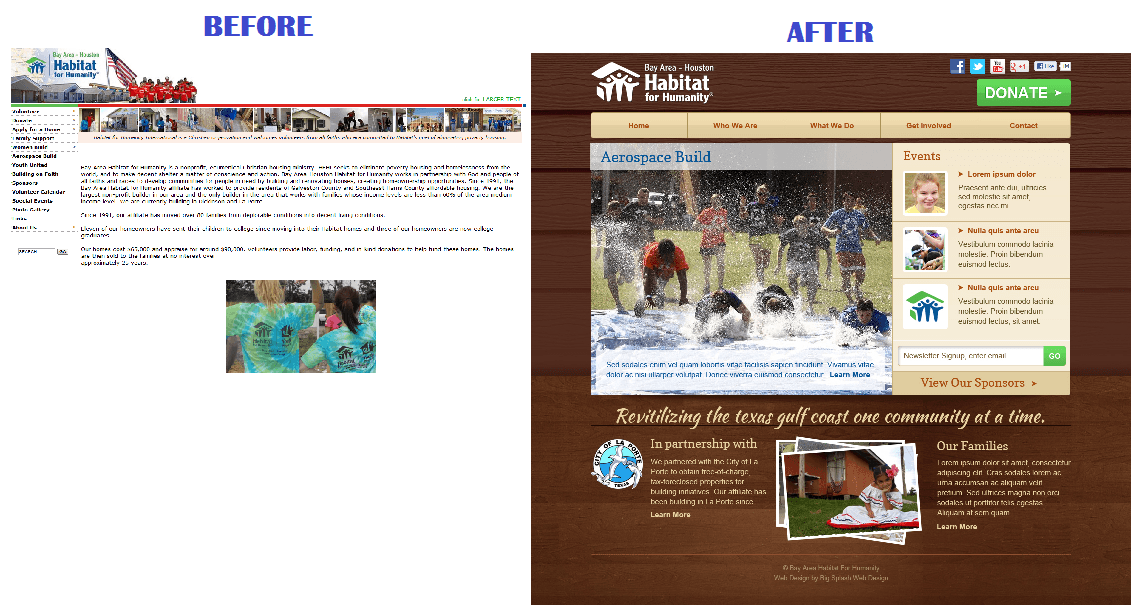
Bay Area Habitat for Humanity before and after website redesign

The Issues
1.      Main navigation was overwhelming and not well organized, with too many pages listed, and their side bar was not user friendly.
2.      The volunteer information and registration form were listed on multiple tabs, confusing the user.
3.      The donation pages were cluttered, and the links to the donation payment were not prominently displayed.
4.       The navigation was cluttered with individual pages for each program they offered (such as Women Build, Aerospace Build, Youth United, and Building on Faith).
5.      Sponsors are a very important part of the Habitat’s funding, and they needed the recognition they deserve on the Habitat’s home page.
6.      The locations they serve were not displayed.
7.      The calendar needed to show events as well as build days.
8.      They needed more stories/statistics about the effect on the families and the community.
9.   The final design needed to show what BAHFH was all about, and establish it as the main Habitat for Humanity in the Houston area.

Website Solution

Big Splash Web Design built a custom website, drawing inspiration from Dallas Habitat for Humanity’s website, but with entirely unique colors and graphics. The design was built using WordPress capabilities, for BAHFH to allow the user the ability to update content without having to rely on further involvement of Big Splash.

After presenting them with multiple mockup options, they chose a home page that showcases a rotating slider as the main graphic. The slider was designed to be updatable by BAHFH, which will now allow them to showcase current events, as well as a map showing the areas they are building in, main sponsors, family stories, and more.

The header was kept image free, highlighting the logo in a clean format, along with easy to find social media “connect” icons and a large “Donate” button to be found on any page of the site.

The events are showcased on the homepage next to the rotating slider, with the most recent and upcoming events being automatically displayed. The logos of the “Partnering Cities”  transition smoothly to give them equal screen time, and the stories about the lives of the families that they have changed are promoted.

Bay Area Houston Habitat for HumanityBay Area Habitat for Humanity is an ecumenical Christian organization founded on the conviction that every man, woman and child should have a decent, safe and affordable place to live. Habitat for Humanity serves people in need regardless of race or religion. Through volunteer labor and donations of money and materials, Habitat builds and rehabilitates simple, decent houses alongside partner families who live below 60% the Area Median Income. Habitat partner families put in over 300 hours of ‘sweat equity’ into building their home enroll in financial literacy classes and repay a zero-interest loan over 20 years. Carrying out the mission of Habitat for Humanity is only made possible through the partnership of corporations, churches, and dedicated volunteers. Bay Area Habitat for Humanity is currently looking for new corporate, church and organizational partnerships to further their service to the community!

Big Splash Web Design & Marketing is a full service website marketing agency specializing in web design, ecommerce web design (shopping carts), website hosting, graphic Big Splash Web Design & Marketingdesign, PPC Management (Pay Per Click) and Search Engine Optimization (SEO) for small and medium-sized businesses and organizations. Our clients range from credit unions and attorneys to doctors, local businesses and online stores looking to expand and improve their online presence. The majority of our clients are from Houston, Texas, but we work with clients from all over the United States. View our website for more information www.bigsplashwebdesign.com
 

Houston Small Business Guide to Google Places

In the past when someone wanted to find a business they reached for the phone book.  Today that is no longer the case.  In fact, a recent survey done by the website Yelp.com indicated that 89% of people polled used the phone book only once a month or not at all.  So where are people going to find businesses instead?  For most people, the answer is Google.

Google is the world’s largest search engine with billions of search queries processed each day.  According to Google, over 25% of those search terms are local in nature, meaning that every day Google processes 3 billion searches each month for local businesses and other topics of regional interest.

It should be noted that as internet-enabled mobile phones become more popular, local search is increasing.  People are using their phone to find out information about a particular spot while on site.  For example, it’s not uncommon these days for a couple to be walking down a street and decide they want to eat out at a restaurant.  All they need to do to find a restaurant is pull out their phone and perform a search for the term, “restaurant”.  Google will present them with several restaurant options nearby.  Local mobile search is a trend that is here to stay.  By the year 2014, it is expected that more people around the world will access the Internet by phone than by computer.  With that change, you should expect an increasing dependency on local search.

Continue reading


5 Reasons Your Business Needs a Mobile Website

mobile website designIf you are responsible for

marketing your business

, then there’s no doubt you are aware of just how important it is that you have a

strong presence on the Internet

.

There are many ways of developing this presence, from

social media sites

to blogs, and you should be taking advantage of all of them. One of the latest, most effective ways of taking full advantage of the world wide web’s

marketing potential

is by using a

mobile website

. A

mobile website

is just what it sounds like – a website specifically designed to be viewed on mobile devices. So, why does your business need a mobile website if its traditional site is doing just fine?

Here are five compelling reasons why:

1) Aesthetic Appeal

You may wonder why people can’t just view your existing traditional website on their mobile devices. The truth is, they can. The other truth is that your traditional website simply doesn’t look very good on a mobile device. Do this: shrink the view on your web browser by zooming out until you have to squint to read the text. Not a good viewing experience, right?
Continue reading


Facebook Timeline Special Offer

Our Facebook Campaigns Include: Helping you dream up an engaging campaign to interact with your fans Creating an interactive custom Facebook fan page and Cover photo for the campaign Send the page out to your email newsletter recipients, and can be printed as flyers!

Limited Time Offer! Share with three of your friends and receive 20% off! (regularly $347) For details call: 281-816-6932


Majorca Bistro Restaurant Website Redesign Case Study

Issue- Needs Analysis:

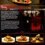
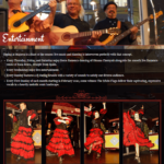
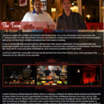
When Hicham Nafaa, an executive chef with numerous successful restaurant chains under his belt, opened Majorca Bistro and Tapas, the only Mallorcan island cuisine in Texas, he pulled out all the stops. He got inspired from a visit to Majorca, a small island off the coast of Spain. His tapas reflected the islands use of more seafood and more almonds than traditional Spanish Tapas, and he added hints of Moroccan influence from his native orgins. Hand painted murals line the walls, hand carved metal lines the patio, rich ambience and artistic flair around every corner. However, their website was  poor reflection the thoughtful approach he took in the restaurant itself.

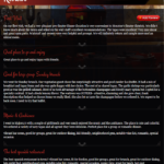
Majorca Menu Page OLDThe issues:

  1. Flash based
    1. The content (including phone, address, etc) was not being properly indexed with search engines.
  2. Poor site map
    1. All of Majorca’s great attributes were not present.
    2. The attributes discussed not organized correctly, leading to:
    3. Too much Content per page.
  3. Poor content.
    1. The content was poorly written
    2. It was filled with grammatical errors.
    3. It was not SEO friendly.
    4. No Menu (only a PDF downloadable version- bad for SEO and mobile users)
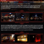
  4. Majorca Events Page OLDPoor photography
    1. The background was a scrolling slideshow of unprofessional, grainy photography
    2. The photography didn’t show the great food, the incredible entertainment, the unique events, or the world-renowned chefs.
  5. Poor Design
    1. The design did not encourage the user to learn more
    2. Multiple fonts confused the eye
    3. The template boxes were boring in shape
    4. Because of the static shape of the flash driven template boxes, the user had to “scroll down” to read the too-long, poorly written, boring content.
    5. majorca Contact Page OLDThe menu had to be downloaded to view
    6. No email newsletter signup
  6. Poor mobile use
    1. Since the website was created in flash, mobile users could not see anything but the slideshow used as the background for the website. No content was visible.
  7. No cohesive marketing program
    1. Majorca had thousands of emails from patrons and partners, but was not implementing a cohesive marketing program that unified their website visitors, email recipients, and social media contacts.


Solution: After discussing all the issues with Big Splash Web Design, the group agreed upon a solution that would meet their needs on multiple levels:

  1. Build on the current look feel and style to match the ambiance of the restaurant and give the web visitor a feel of what they will expect when they come to dine.
  2. Add a call to action to encourage web visitors to input their contact information to collect for monthly email newsletters.
  3. Assist photo shoot for the professional photos which were critical to the design
  4. Multiple photo galleries
  5. SEO-friendly page names and meta-data
  6. Social media share tools (ability to share information through Facebook, Twitter)
  7. Easily updatable content
  8. Mobile Version of site (mobile switcher, device adaptation, a mobile admin panel, and mobile analytics).
  9. Custom weekly newsletter created for website, synced to custom email template to automatically send out to thousands of email contacts, and shared through social media.


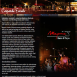
Corporate Events Page
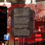
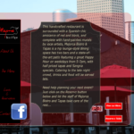
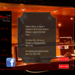
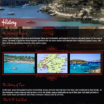
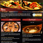
Dining PageEntertainment PageHistory PageMenu PageTeam PageReviews PageVenue Page

Result:

A website that gives the look and feel of the restaurant itself, with easy to read, organized, keyword embedded content, and gorgeous pictures.


Client Review:

Kasie and Big Splash did an amazing job designing my website! it’ s fun working with them as they are very professional and reliable! I recommend using them for your future needs!! Thank you Kasie, you are the best…


AMOCO Federal Credit Union Chooses Big Splash Web Design for 75th Anniversary Mini-Site

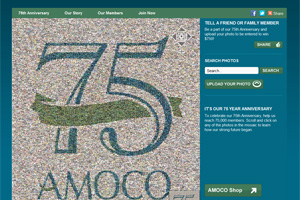
amoco anniversary websiteFRIENDSWOOD, TEXAS (April 3, 2012) – Big Splash Web Design has created a custom mini-site for AMOCO Federal Credit Union, based in Texas City, TX to celebrate the credit union’s 75th anniversary. The new site, http://anniversary.amocofcu.org, is designed to highlight AMOCO FCU’s members, their growth, and their history through an interactive photo mosaic.
AMOCO FCU came to Big Splash with their request for a specialty site built around a photo mosaic similar to the one at eHarmony. The credit union loved the features of the eHarmony mosaic, and wanted similar features which would allow credit union members to submit their own photos and stories. Big Splash partnered with the company that designed eHarmony’s mosaic — Picture Mosaics — to create the new site for Amoco FCU. Big Splash built the mini-site around the mosaic, and created an interactive photo timeline of the credit union’s 75-year history using both photos and videos. By partnering with Picture Mosaics, Big Splash was able to provide a time- and cost-effective solution for Amoco FCU, one of their on-going clients.

Since being first chartered in 1937, AMOCO Federal Credit Union has grown from $28,000 in assets and 169 members to more than $543 Million in assets and approximately 59,000 members to date. Recognized as one of the largest credit unions in the Houston/Galveston, Texas area.

Picture Mosaics creates custom photo mosaics for all print and multimedia genres. The company engineers the latest software and design techniques to allow their digital designers to build photo mosaics that are both technical and artistic marvels. Their products include prints, jigsaw puzzles, interactive mosaics, large scale murals, and full motion video mosaics. The company is continually developing new, cutting-edge products and applications. More information about Picture Mosaics is available on their website, www.picturemosaics.com.

Big Splash Web Design and Marketing is a full-service web design and internet marketing agency located in Friendswood, Texas. They offer custom web design, mobile applications, search engine optimization (SEO), email marketing, social media marketing, and graphic design.