Issue- Needs Analysis:
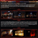
When Hicham Nafaa, an executive chef with numerous successful restaurant chains under his belt, opened Majorca Bistro and Tapas, the only Mallorcan island cuisine in Texas, he pulled out all the stops. He got inspired from a visit to Majorca, a small island off the coast of Spain. His tapas reflected the islands use of more seafood and more almonds than traditional Spanish Tapas, and he added hints of Moroccan influence from his native orgins. Hand painted murals line the walls, hand carved metal lines the patio, rich ambience and artistic flair around every corner. However, their website was poor reflection the thoughtful approach he took in the restaurant itself.
- Flash based
- The content (including phone, address, etc) was not being properly indexed with search engines.
- Poor site map
- All of Majorca’s great attributes were not present.
- The attributes discussed not organized correctly, leading to:
- Too much Content per page.
- Poor content.
- The content was poorly written
- It was filled with grammatical errors.
- It was not SEO friendly.
- No Menu (only a PDF downloadable version- bad for SEO and mobile users)
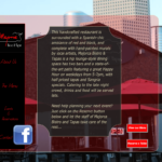 Poor photography
- The background was a scrolling slideshow of unprofessional, grainy photography
- The photography didn’t show the great food, the incredible entertainment, the unique events, or the world-renowned chefs.
- Poor Design
- The design did not encourage the user to learn more
- Multiple fonts confused the eye
- The template boxes were boring in shape
- Because of the static shape of the flash driven template boxes, the user had to “scroll down” to read the too-long, poorly written, boring content.
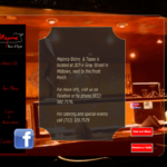 The menu had to be downloaded to view
- No email newsletter signup
- Poor mobile use
- Since the website was created in flash, mobile users could not see anything but the slideshow used as the background for the website. No content was visible.
- No cohesive marketing program
- Majorca had thousands of emails from patrons and partners, but was not implementing a cohesive marketing program that unified their website visitors, email recipients, and social media contacts.
Solution: After discussing all the issues with Big Splash Web Design, the group agreed upon a solution that would meet their needs on multiple levels:
- Build on the current look feel and style to match the ambiance of the restaurant and give the web visitor a feel of what they will expect when they come to dine.
- Add a call to action to encourage web visitors to input their contact information to collect for monthly email newsletters.
- Assist photo shoot for the professional photos which were critical to the design
- Multiple photo galleries
- SEO-friendly page names and meta-data
- Social media share tools (ability to share information through Facebook, Twitter)
- Easily updatable content
- Mobile Version of site (mobile switcher, device adaptation, a mobile admin panel, and mobile analytics).
- Custom weekly newsletter created for website, synced to custom email template to automatically send out to thousands of email contacts, and shared through social media.
Result:
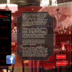
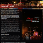
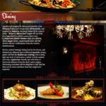
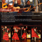
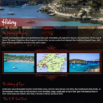
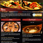
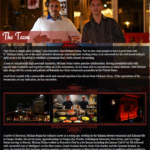
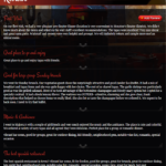
A website that gives the look and feel of the restaurant itself, with easy to read, organized, keyword embedded content, and gorgeous pictures.
Client Review:
Kasie and Big Splash did an amazing job designing my website! it’ s fun working with them as they are very professional and reliable! I recommend using them for your future needs!! Thank you Kasie, you are the best…
